- UID
- 83
- Online time
- Hours
- Posts
- Reg time
- 5-9-2017
- Last login
- 1-1-1970
|
Edited by cynic at 29-8-2018 06:00 PM
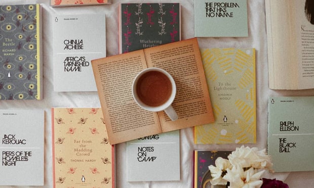
To paraphrase John Waters: “We need to make books cool again. If you go home with somebody and they don’t have books, don’t sleep with them.” It’s a funny sentiment, but one he may feel has finally been achieved, as books – and their covers – have become something of an accessory.
The rules of book cover design change decade by decade. Covers from the 1990s now look colourful and almost too busy (the wardrobe of the Fresh Prince of Bel Air would be a close aesthetic comparison). Tim Kreider, writing for The New Yorker in 2013, identified a lull in book design in the early 2010s that was exemplified, as he saw it, by a crop of white covers with simple lines of text (think Malcolm Gladwell or Haruki Murakami).
For a time, it seemed that eBooks and kindles would displace their physical counterparts, but this didn’t quite come to pass. Like the recent revival of zines, the encroach of digital has resulted in a renewed appreciation for the physical – and beautiful. Part of this has been in direct response to eBooks; a tactic to boost the sales of physical books is to remake them as desirable objects, and a way to make objects desirable is, of course, to make them aesthetically appealing. But social media – specifically Instagram, which promotes the coveting of beautiful covers on hashtags such as #bookstagram – is putting a new emphasis on cover aesthetics. We no longer need to go home with someone in order to see their bookcase.
“With social media, people display their books in more places than their personal libraries at home. They’ve almost become an accessory in some cases,” says Rachel Willey, a designer behind covers including Patricia Lockwood’s Priestdaddy (the title takes the form of a nameplate necklace against a freckled chest) and Melissa Broder’s merman-romance The Pisces (a woman passionately embracing a fish).
“If I don’t like the cover, I won’t photograph it and put it on my feed,” says Femke Brull, a “bookstagramer” who runs @booksfemme. While she won’t avoid promoting a loved, if less-attractive book, she opts for a snap of the title page instead – even if it is less memorable than a beautifully covered counterpart. And she will “pay extra” for what she considers a better-looking edition.
“I plead guilty to buying multiple copies of a book because I’ve seen an edition floating around that is prettier than my own,” Emily Klump (of @litinquiry) says. I’d do this too; I was disappointed when my own copy of Patricia Lockwood’s Priestdaddy arrived, with a cover that wasn’t Willey’s design.
Faber and Faber’s recent releases signify a new focus on design; the publisher is giving away free letterpress prints of the cover of Sally Rooney’s new book Normal People (an ink illustration of a couple encased inside a tin of sardines) to those who pre-order. For Rachel Cusk’s Faye trilogy, designer Rodrigo Corral used work by the photographer Charlie Engman, whose pictures are often featured in magazines such as Vogue – and accordingly, the Cusk covers are stylish in a way that brings to mind coffee table or art books. Corral says social media directly affects his designs: “Our jacket art often has social media in mind, as we often create animated gifs, profile icons, and moving images that expand on the book jacket art and are designed to spread across the internet.”
Chris Kraus’s I Love Dick, originally published in the US in 1997, was published in the UK for the first time in 2015, to a new wave of popularity. This was in no small part due to the zeitgeist catching up with Kraus; still, it’s not a leap to say its success could also be credited to a new, memorable cover: I LOVE DICK, emblazoned in big, bold capitals. In her review for the London Review of Books, Jenny Turner likened it to a pop single, in which the “song and band and title and cover all worked together to make what, if you were lucky, would be seen as an instant classic.”
Wolfgang Tillmans’ “astro crusto” covers Olivia Laing’s latest book, Crudo: a clean, almost synthetically shiny, cracked crab of a delicate pink, with a fly hinting at decay. Laing has described Crudo as the first book for which she knew exactly what the cover should be (Tillman’s photograph brought to a mind a scene in which protagonist Kathy opens a crab with a hammer). It’s rare for a cover to have such a symbiotic relationship with its book, but that’s not to say that the two should be totally detached. A cover can’t change the contents of its book, but it can be a reader’s first impression of the book’s identity, especially with social media; as Willey says: “People now see covers before they get released, before even going to a bookstore.”
The evolution of this relationship between platform, design and literature is seen in the New York Public Library’s new “Insta novels” project, which will see the library release animated condensed versions of novels such as Alice’s Adventures in Wonderland as Instagram stories.
Even the fashion world has caught on to the idea of the book as accessory: for their 2018 autumn/winter campaign (which featured models reading), Loewe created a box set of literary classics, include Dracula and Don Quixote, with covers by photographer Steven Meisel. If this all makes you despair – that books’ insides are being usurped by their outsides – Loewe’s campaign is also a reminder of the gravitas that books bring. They aren’t just well-designed accessories, they’re items that imply intellect. “Imply” being the key word; no matter what Waters said, no one is going to sleep with you unless you get past the cover.
Source
|
|
 |
|  |
|  |
|
 العربية
 Deutsch
 Español
 Français
 한국어
한국어 |
|


 Post time: 29-8-2018 17:57:09
 Post time: 31-8-2018 20:57:13
 Author
 cynic
cynic  2-9-2018 02:13 PM